
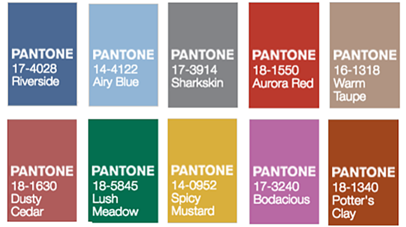
Last week we experienced the first day of fall. I don’t know about where you live, but here in Virginia Beach is was as hot and muggy as ever and left me feeling a little less than excited about fall. I can only have so many pumpkin spice lattes before feeling like I’m faking my joy. SO, like any millennial, I took to the internet for inspiration…there I found this season’s Pantone colors.
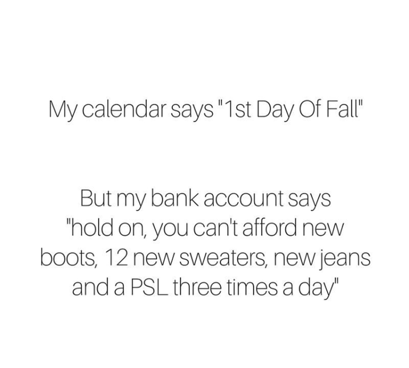
I, not only immediatly wanted to paint my nails in all of the above colors, but I also wanted to refresh my wardrobe! This insta that Elite Daily posted last week def describes my life tho…
SO, I went on a hunt and found items in a few of the above colors that I love and that are under $100 because y’all, fall is expensive. You gotta plan ahead and purchase quality pieces that are going to last you year after year.
I have succeeded in this strategy for years during the warm seasons. My summer wardrobe is, and has been, on point. Now, you and I can do the same for the cold seasons together.
Favorite Pantone Color #1: Sharkskin

Favorite Pantone Color #2: Spicy Mustard
Favorite Pantone Color #3: Lush Meadow
Favorite Pantone Color #4 …Colors actually: Riverside and Airy Blue
Final Favorite Pantone Color: Dusty Cedar
Like I said above, you don’t have to make your wardrobe perfect over night. It takes time and diligence. I invest in one to two pieces a month. I discern what I want to invest in by asking myself, “if this was gone tomorrow, would I be sad?” If the answer is yes, then welcome to the Tilley closet! If the answer is no, I move on.
How do you decide what gets added to your closet?

Omg what a fun list!! I just love that! The colors are so fun this year! 🙂
I really love that Amazon scarf in the spicy mustard category! I’ve been looking for new scarves so I may have to look into it further!
Caitlyn | http://www.collegewithcaitlyn.com
I love the taupe and especially the dusty cedar!
Great picks! I love anything airy or dusty haha #basic
Rachel | http://www.theconfusedmillennial.com
Sharkskin is my #1 this season!
Oh man, I wish I could afford this stuff, but we have so many things to do around the house. Wishful thinking because they are all SO cute!!!
I love all the color choice but really want to try the bodacious color!
xoxo, Candice
http://www.candicenikeia.com
Oh my gosh, airy blue is so pretty! Love it!
xoxo,
Katie
chicincarolina.blogspot.com
Definitely loving the lush meadow and spicy mustard!
These colors are so pretty and Bodacious has to be my favorite! It’s such a beautiful color!
xoxo
Amy | Pastel N Pink
I love all of these colors! They’d all make perfect polish shades, I totally agree. I could always use more of the “spicy mustard” color in my closet.
Kayla | kaylablogs.com
That quote though lol! I love the dusty ceder, it’s pretty much a neutral! What a creative post!
xoxo
I’m loving the hints of lilac – or “bodacious” – I see popping up in interior design thanks to Pantone’s color picks. Such a feminine shade, and it’s interesting to see designers intermix it into existing interiors.